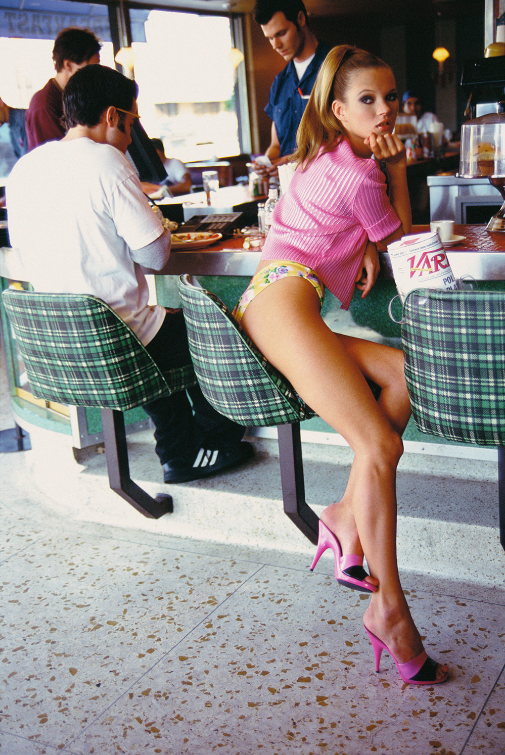
NEIL KRUG ‘FIGURES, LANDSCAPES’
2021-02-01Occupying a style and perspective completely his own, Neil Krug’s dreamy photographs look like they’re from another space and time. His images, at times surreal and almost unearthly, are always beautiful, and even in their experimental style are extremely present and possess a certain kind of electricity.
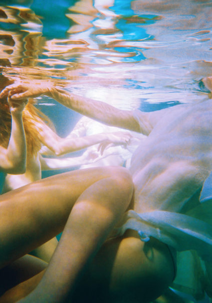
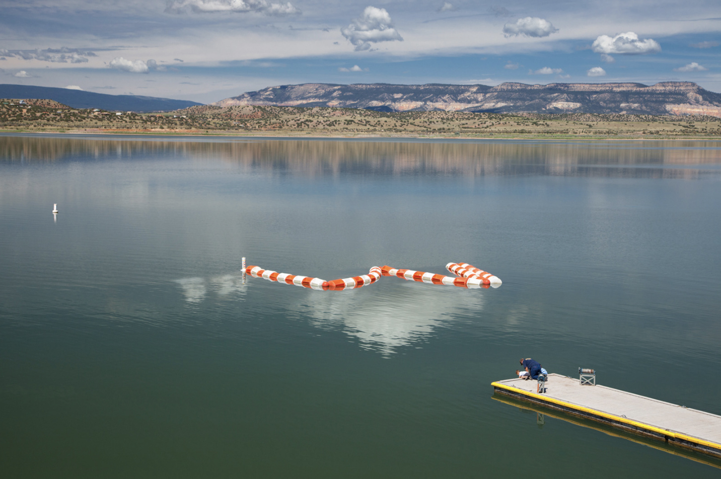
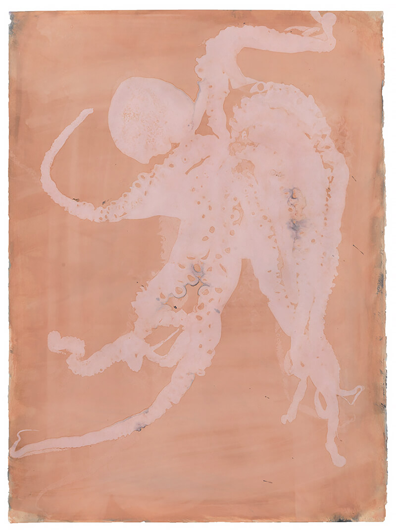
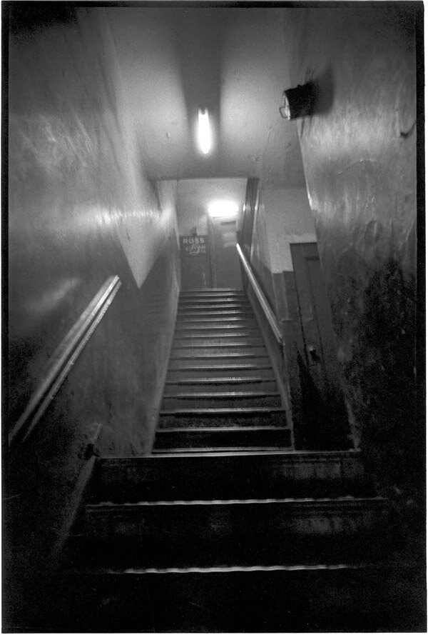
After the success of ‘Pulp Art’ in 2010, his hypnotic first book, Krug has designed a world of his own, working with musicians and brands, as well as continuing his personal work. The photographer, filmmaker and artist is currently presenting nine limited edition fine art prints entitled ‘Figures, Landscapes’. The collection is available till February 14th, 2021. I caught up with Krug to talk fantasy, daydreaming, and Lana Del Rey.
How’s it in LA right now? It’s snowing here in London…
It’s sunny, which is probably no surprise.
And how has the last year been for you, with everything going on in the world – has that changed the way you take your photographs, or not?
The last year was… how does one even describe it succinctly? It was an experience that humbled me and everyone I know. Ultimately, I’m grateful to be alive and to still be making work. My partner is an artist as well, so she and I quarantined at home and did our best…
I haven’t changed how I do what I do, but one thing I did attempt was the whole Zoom-photoshoot scene that’s been happening online. My musician friend Nat Cmiel (who goes by Yeule) is based in London and couldn’t safely be in LA with the pandemic being what it is, so she and I shot her album campaign over Zoom. And believe it or not, it looks great. I don’t think people will be able to tell that we made the work 5,000 miles apart.
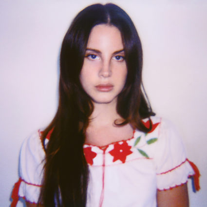
Transportation is something I think about when looking at your pictures. There’s an element of fantasy and a powerful cinematic atmosphere. I love the idea of your cover shot for Ultraviolence (Lana Del Rey’s 2014 album) being the last thing you see before the end credits of a horror film. What inspires the mood in your images?
That’s the ultimate goal when making any piece of work for me. That feeling you just mentioned: escapism. And hopefully that the atmosphere is worth remembering. I don’t always nail it, but I’ve tried my best to achieve that in everything I do, so that at the end of the day the entire body of work feels like one giant ball of string that keeps rolling along.
The idea for the “horror film end credits” cover for Ultraviolence [Lana Del Rey] came from my desire to introduce a little narrative that Lana and I could chase together, and to honour the muse of the project. I was imagining a sort of black-and-white, 16mm-looking nightmare. Almost in the vein of The Honeymoon Killers from 1970, or the original sixties Night of the Living Dead but with a beautiful, brooding heroine as the hero. What if Lana replaced Catherine Deneuve in Repulsion… what would that look like? For me, the whole project was made in that spirit, and I shot tons of black-and-white imagery to suggest that kind of iconography. I kept all my colour imagery for the more fairy tale- like themes. Dorothy/Wizard of Oz vibes, but with Dorothy smoking a cigarette in a bed of hydrangea. With that particular album [Ultraviolence], I think the obvious thing to have done would’ve been to present Lana in some violent, over-the-top artwork to complement the title, but I think the cover would not have dated well had we gone too on the nose with it.
I heard that you get a lot of inspiration from your daydreams. What are you daydreaming about at the moment?
That is true. The daydream space I go into has done me well over the years, probably due to the fact that I’ve gotten better about making time for it and understanding its creative function in my life. When I was putting together Phantom: Stage One, I was dreaming about figures standing around volcanoes, bodies moving through heat, a sort of freak out moment amongst a large crowd of people in a rugged landscape.
I remember I was listening to May Blitz in my studio around this time and there’s line in one of their songs that goes: “Rivers of fire flow through the air, progress to the end,” and that particular line carried a lot of weight for the overall creative of the project, almost like a mantra to keep the project in focus. It’s usually sounds that get an idea going, but overall, the daydream-meets-inspiration is a mysterious process that I don’t fully understand — nor do I want to understand it. Even putting it into words feels strange.
If you could describe your aesthetic in one sentence what would it be?
I have no idea. Whenever I’ve given an answer to this in the past, it usually comes back to haunt me. I don’t know… today… let’s call it the splintered aesthetic.
How did growing up in Kansas influence you and your idea of Americana?
If Kansas was an influence, it was merely the place I wanted to escape from, so this whole idea of transportation and escapism might’ve grown from the desire to be elsewhere and to experience something different.
I have always found the AIP (American International Pictures) films to be the biggest influence on me –– especially as a younger man, and probably the best answer to your original question regarding Americana. I feel as though some of those films are part of my DNA: the absurdity, the larger-than-life, the overall “no fucks given” quality is definitely part of the bedrock on which I stand creatively. I react to things like the Mimsy Farmer LSD freak out sequence in the AIP film Riot on Sunset Strip, or the soft-core sounds of 70’s grocery store music. My inspirations have always come from oddball things and often I don’t see it surface in my work until way after that fact.
‘Pulp Art’ is one of those rare books that when you dive inside make you believe you’re looking at gorgeous sun- drenched, warm hued photographs captured in the past. How is it putting together a book of your images? Can we expect another book soon, from your archive or new work?
The original idea for the Pulp books was simply to make a collection of works that felt more genre-bent, illustrative, and absurdist. Tying it all together was this sort of druggy-AIP-exploitation-laced narrative that guided you from one scenario to the next.
I shot those works when I was 24 and 25 and there’s definitely a few aspects about the work I wish I could go back and fix, but at the end of the day I suppose that’s part of the charm of the work. To fix the work would go against the heathen-credo-absurdity of the book.
I am happy to report that I have a few new books finished that I hope to present soon: two of the monographs I started work on in 2016, and also a collection of work I made in Japan during the summer of 2018. All three works are fundamentally different from each other and they are my absolute favourite works I’ve ever made.
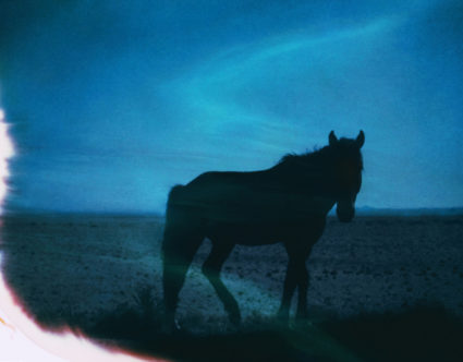
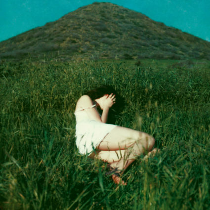
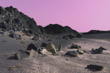
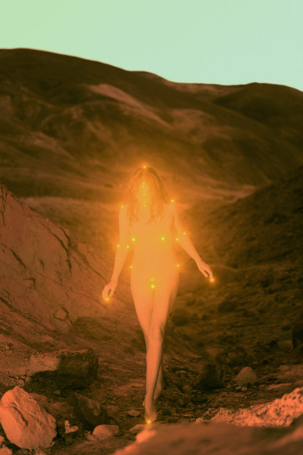
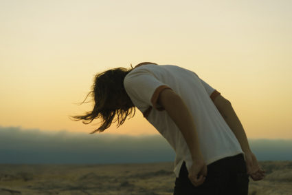
Tell me the story behind the prints for ‘Figures, Landscapes’
Figures, Landscapes is different for me, as it’s not part of a narrative that I sought out to make. It simply is work that I make when no one is looking, and I have no objective other than to make pleasurable, brooding images. I’ve been shooting and archiving works in this style for years and years, and it was my partner who had the idea for me to showcase a glimpse of the work as limited edition prints before 2020 ended.
So many of my projects come with big, heavy titles, and have so many things packed in. It can be distracting from the purity of the form I suppose. Closing 2020 and beginning 2021 with this collection feels like an honest way of saying ‘hello’ to everyone, and giving them space to dream.
Can you tell me more about how you play with colour? How do you decide what colours fit the narrative and energy of an image, or is it just instinctive?
With colouring the work, it’s completely improvisational and feeling-based. I don’t have an exact formula I can put into words. Sometimes it’s as simple as I’ve done too many things in a row with the same colour palette, so it’s time to switch things up. Other times it’s a cosmic pull towards a colour palette and it can be no other way. I kind of think of it like cooking a good meal and mixing a bunch of ingredients without knowing the specific recipe. You find your way there, and you know when it tastes right.
The women in your pictures have a captivating mix of vulnerability and strength. Why do women play such a big role in your work?
Women do represent both of those qualities you mentioned, and it’s something I attempt to showcase in the work from a place of respect. I approach all of the projects with my collaborators as if we’re all playing a role to build an idea and the creative, and I think some of my best work has come from those collaborations. To answer your question, women play a big role in my life because these women are a part of my real life. It’s not so much cherry picking models to work with as it is enjoying and honouring working with those who naturally influence the work. It’s more chemical.
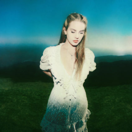
Let’s talk about your divine collaborations with Lana Del Rey please! Your friendship started with Lana coming across your book and thinking it must be from the past, that you must be dead! There’s a real magic in your photographs of her. How is it working with LDR? Can you recall a particular moment that really sticks with you?
I was dead but have risen from the grave. I’m Lazarus with a Polaroid camera looking for a glass of wine.
Lana and I have been shooting off and on since 2014 so it’s impossible to name a particular moment that has stuck with me. We’ve had plenty of quiet creative moments over the years, and times with the opposite: fans chasing her down the street in some kind of LA version of A Hard Day’s Night. She was kind to me when I was at my lowest ebb; and conversely, I’ve come in and saved the day for her a few times, as well. It’s a mutual admiration society based on trust.
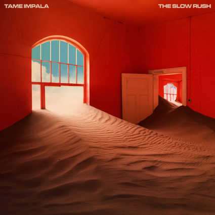
Having worked with other artists such as The Weeknd, Bonobo, Tame Impala… just to name a few. How do you take on shooting an album cover?
Each project is different from the last, and it’s never exactly the same in terms of process. Sometimes I bring everything to the table, and other times the artist already has an idea in mind, but they want my perspective on the shot.
Album covers for me are about reducing everything I’ve heard, seen and felt about a record into its simplest form. It’s like an explosion –– there’s fire and smoke, and then the dust settles. What’s left to be seen is the image I’m searching for.
I think the best example in the recent past is the The Slow Rush packaging I made for Tame Impala. Kevin called me and said he wanted to go to Namibia to shoot in an abandoned mining town for the cover of his next record. I loved the idea, but I was worried the label would freak out at the fortune it would cost to produce such a shoot. Thankfully it was Kevin’s idea so it was cleared immediately.
The shoot was fantastic, and it was an epic journey too big to put into words here. For me, the edit session was brilliant. Kevin was in town [Los Angeles] during that time, so he would roll over for “wine and edit time” every day and we would piece the package together bit by bit –– which is something that almost never happens.
The best packages are when everyone (artist, designer, management, label) cares about making something impactful. Then you can’t go wrong.
Do the artist and record influence your vision, or can it be the other way around?
Definitely… and when that happens it can produce the best works. When it doesn’t happen, I just improvise something to make it work.
What music are you into right now? And films?
I saw Femina Ridens (The Laughing Woman) from 1969 for the first time in 2020 via bootleg copy. It’s a film that’s hard to find, and it would be even harder, if not impossible, to get made today for a variety of reasons –– sadism being one of them. The music in that film by Stelvio Cipriani is incredible, and is something I play in my home often.
Music wise, I’ve been blasting Morricone in my studio since he died last year and will listen to his work until the end of days. RIP Maestro!
What would be your dream subject or place that you would like to photograph? And what’s your next move?
Right now, nothing comes to mind. My next move is dinner.
Words – Lo Harley
Tweet