RED WING – LIMITED EDITION POSTMAN BOOT

Posted on 2015-07-13

Inspired by the 101, the 9197 is a 6-inch style rather than an oxford, and is crafted with Black Chaparral leather, a black cushion crepe and wedge outsole for a classic look.

In the 1950’s policemen still walked their beats and the postman walked his mail route. They needed comfortable and sturdy footwear for the eight hours spent on their feet. In 1954, Red Wing responded with style no. 101, a sturdy black oxford with a moldable insole. It could be polished to meet their uniform requirements, but tough enough for everything their day encountered. The 101 would go on to be part of the Red Wing brand for 46 years and sell over 2 million pairs. It became one of the best selling styles in company history. The 9197 is modeled after that famous 101 style.

www.redwingheritage.com


ALIFE + BAPE

Posted on 2015-07-13

In Celebration of New York Sneaker Shop and apparel Brand, ALIFE’s 15 year Anniversary, A BATHING APE and ALIFE will bE launching a collaboration collection.
The Collection Features an Original graphic using BAPE’s famous camouflage pattern embellished with ALIFE’s icon.

www.bape.com
www.cambridgesatchel.com


JJ PEET – MAGiCSTANCE

Posted on 2015-07-13

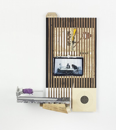
Although sculptural, PEET’s Stilifes relate to still-life painterly traditions, and the genre’s use of commonplace objects to depict broader allegorical commentary on everyday human experience specific to a time and place. PEET’s work – whether painting, ceramic, drawing, or more performative acts, such as The TV Show live broadcasts or Barter_Station – always engages with the world in a direct and active way. PEET takes on a form of guerilla journalism – gathering information and evidence of the socio-political climate that is contemplated and reassembled in the studio – in an attempt to make sense of the chaotic and violent experiences of individuals on our planet.

PEET’s long held interest in ceramics is evident in Stilifes. He continues his exploration of ceramics as a medium that can interface easily with other materials, offering the most basic and malleable method to generate objects, aptly described by PEET’s manifesto “From brain to hand to object.” Furthermore, clay contains an indexical imprint of the artist’s hand and movement, a direct “proxy” for the artist’s energy and intentions, physically and metaphorically binding the various elements of a Stilife together. PEET reimagines handheld devices, the type that function as continuation of self, such as phones and cameras, into a cache of tools in porcelain and stoneware – Burner phones, Viewers, Proxy Cups, Filters – that feature prominently in PEET’s Stilifes.

MAGiCSTANCE refers to the idea that when a viewer is alert, aware, and attuned to a greater consciousness, unexpected connections and coincidences are more likely. Active observations can inform us, and offer an alternative to a more passive filtering of general news feeds and recycled information. Stilife sculptures are arranged to generate meaning in the moment of time we are in, prompting – for artist and viewer alike – a slower and more concerted mode of looking.

Opposite – BRONBINDER_, 2015

Exhibition runs through to July 31st, 2015

On Stellar Rays
1 Rivington Street
New York
NY 10002

onstellarrays.com


MARC QUINN – THE TOXIC SUBLIME

Posted on 2015-07-13

‘The Toxic Sublime’ series are distorted, three-dimensional seascapes that blur the boundaries between painting and sculpture. They begin with an inherently contradictory artistic gesture whereby Quinn submits a photograph on canvas of a sunrise to a process of aggressive alteration. The photograph is first sanded and taped, then spray-painted through various templates comprising flotsam and jetsam gathered from the beach. Once this process is complete, the artist takes the canvas out onto London streets and introduces the impressions of drain covers into the surface of the work. This intrusion is suggestive of how water, which is free and boundless in the ocean, is tamed, controlled and directed by the manmade network of conduits running beneath the surface of the city.

The degraded seascapes are finally bonded to a sheet of aluminium, to be pummelled and contorted by Quinn to create sculptural hybrid objects that not only exhibit the formal elements of classical landscape painting but also are suggestive of something wrecked, as if a pictorial remnant discarded from some kind of physical disaster. Moreover, while all the works originate from the same image of an orange-tinted sunrise, they each emerge inherently unique, the result of a distinct physical and material manipulation.

Alongside these paintings, a new series of sculptures, minimal arcs in stainless steel and white concrete, including one measuring over 7m long, form part of a body of work titled ‘Frozen Waves’. These primal, gestural shapes originate from the remnants of shells, eroded by the endless action of the waves. In the moment before they disappear and become sand, all conch shells end up in a similar form – an arch that looks like a wave, as though an unwitting self-portrait by nature. With titles referencing the science of fluid dynamics, Quinn captures this ancient action of time and tide using the most recent three-dimensional technology.

Opposite – Frozen Wave (The Conservation of Mass), 2015

Exhibition runs through to September 13th, 2015

White Cube Bermondsey
144 – 152 Bermondsey Street
London
SE1 3TQ

whitecube.com


KIM GORDON

Posted on 2015-07-13

In this new body of work, Gordon’s primary concern is the radical change in the landscape of New York City over the past several years. For the past 20 years Chelsea has been a center of urban renovation, including the opening of the highline in 2009. Small parks appear randomly in the middle of a street. Outdoor sculptures often accompany the arrangements. The new lushness of New York would seem to reimagine NYC as a city for the people, as well as a more attractive landscape for new consumers.

Gordon’s work upends this notion of beauty, exploiting its inherent artifice. New condo developments are named with boardroom idealism – The Rushmore, Fortress of Glassitude, Greenwich Lane – bestowed to evoke a desirable and ineffable lifestyle. The exhibition’s floor paintings repurpose these hollow slogans onto crumpled canvases, makeshift eponyms inscribed with black paint. The painting of the show’s title “The City is a Garden” hearkens back to an East Village aesthetic found in the neighborhood’s funky community gardens. Here, at the entrance, it appears as an overturned emblem, the refuse of misappropriated ideas.

Opposite – The vessel, a performance, 2015

Exhibition runs through to July 24th, 2015

303 Gallery
507 W 24th Street
New York
NY 10011

www.303gallery.com


ANT-MAN

Posted on 2015-07-13

The next evolution of the Marvel Cinematic Universe brings a founding member of The Avengers to the big screen for the first time with Marvel Studios’ “Ant-Man” when master thief Scott Lang must embrace his inner-hero and help his mentor, Dr. Hank Pym, protect the secret behind his spectacular Ant-Man suit from a new generation of towering threats.

In theatres July 17th, 2015

marvel.com/antman